

Concept: ‘Stream’ Smartphone Packaging
 The main inspiration behind the logo was to bring the essence of the modern technology and practicality combination. The logo’s centerpoint is an elegant typeface running on top of a strip of a deep orange colour, symbolising simplistic approach to energised and innovative technology.
After an extensive research on the kind of typeface is associated the most with technology,’Raleway Thin’ proved to be an excellent choice. With its sans-serif design and elegant curves, the typeface reflects the phone’s thin lines and overall elegant industrial design.
The final element of this branding concept is a maze created from a multitude of squares, symbolising the complicated yet structured nature of today’s global network.

Packaging
The outer box design carries strong branding with the logos and the maze displayed prominently. It should be noted that while the outer box is of dark grey colour, the inner box, which slides out, is of one solid colour-the ‘Stream Orange’. 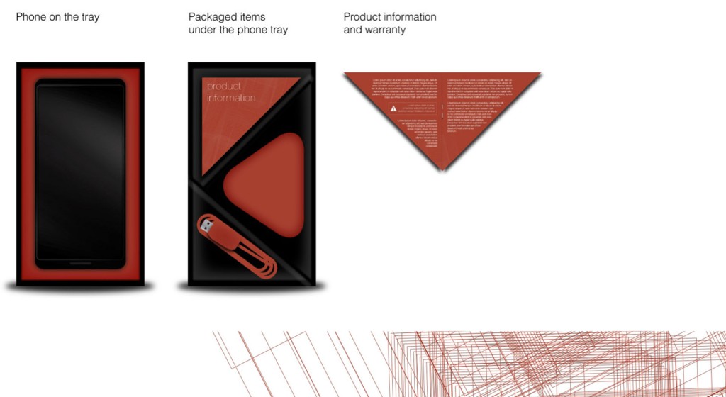
Contents Arrangement
‘Stream’ strives to be as environmentally friendly as possible, therefore the whole box is designed in such a way that no piece of plastic and other hard-to-recycle materials were used.
In addition, the compartments inside the box are arranged to use most of the space, while keeping the box relatively small in volume. It should be noted that the product information and warranty booklet is cut in a shape to fit one of the compartments in an attempt to reduce the overall packaging volume.

‘Breeze’ Instructions Booklet
‘Breeze’ is the instructions booklet that is included in every box of ‘Stream’. Its design is clean, simple and straight to the point.